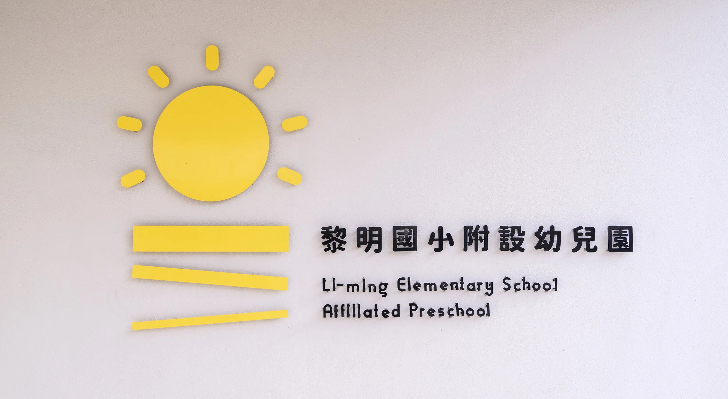
Li-ming Elementary School Affiliated Preschool
黎明國小幼兒園
2021・Wayfinding
location
Taichung, Taiwan
realization
Feb 2021
client
Li-ming Elementary School
architecture
Office AAA
design principal
Szu-an Yu
地平面升起了太陽
以「地平面升起了太陽」和各種自然界的代表性元素,作為黎明國小幼兒園的故事主軸;海洋、草原、森林、微風、白雲、彩虹、藍天,以太陽為核心自成一個迷你世界。
The sun rising from the horizon
"The sun rising from the horizon" and the various elements from mother nature itself was the major storyline; from the ocean, the grassland, the forests, the breeze, the clouds, the rainbow, to the blue sky, together they form a miniature world that revolves around the sun.
從專屬識別標誌到班級的命名
黎明國小幼兒園的指標系統,包含了幼兒園專屬的識別標誌設計,以及班級的命名提案;我們從「地平面升起了太陽」這個想法出發,向大自然取經,希望賦予每個班級不同屬性的同時,也透過樓層高低來暗示各種自然元素分屬於環境的不同高度,從海洋、草原到森林,以及微風、白雲、彩虹到藍天,一同以太陽為核心自成一個迷你世界。
The wayfinding system for the Li-ming Elementary School Affiliated Preschool includes tailor-made identity design for the preschool, as well as a proposition for names of the classes. With "the sun rising from the horizon" as the starting point and taking cues from mother nature itself, we hoped to use the height of the floors to allude to the different altitudes of the various natural elements while also setting each classrooms apart; from the ocean, the grassland, to the forests; from the breeze, the clouds, the rainbow, to the blue sky, together they form a miniature world that revolves around the sun.
幾何的造型設計
在指標的造型設計方面,配合建築空間強烈的幾何感,皆以圓形、平行四邊形相互搭配;而色彩計畫也與建築個性同步,採用黃色為基調,藍色與白色作為輔助串起整個系統,並透過指標面板複層的構造設計,將黃色與各自然元素代表色搭配的同時,也能呈現出細緻的立體感。
The design of the signage reflects the prominent use of geometric shapes in the architecture and uses circles and parallelograms for all signs. The color system also syncs with the personality of the architecture, adopting yellow as its main color and blue and white as supplementary colors to bring together the system. The multi-layered design of the sign panel gives a delicate impression of depth while harmoniously pairing yellow with the colors of the natural elements.


